Been doing some more ‘mixing & matching’ with my stencils to create some new sign designs.
I honestly can’t decide which top/bottom border I like best. Which do you think looks best and why? The original stencil was like the one on the right, but with the border at the bottom ONLY. I really prefer the ‘balance’ of the borders on the top and bottom.
 I designed this specialty sign shape a while back upon request from an etsy customer. The customer flaked out on buying the custom sign, which left me with the leftover special sign shape. What do you think about the borders at the top and bottom of this one??
I’m really trying to stay away from using the stencils ‘as purchased’ by changing things up a bit and creating more unique designs. etsy is getting bigger and BIGGER and there is starting to be a LOT of the SAME items being offered by a multitude of different shops. Hoping that having designs that they don’t see all over the place and over and over again will give my sales a much needed boost.
 New style “Junk Collector” sign. (Original stencil that I purchased was JUST the words; plain and simple.)
And it’s a perfectly fine sign like that. I’m just trying to create more signs that people haven’t ‘seen everywhere’ already.
New style “Salle de Bains” sign; again, I just added the borders.
 “Parisserie” with borders. Can’t decide if I like this one better, or the “French Patisserie” below better.
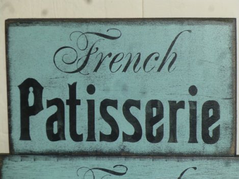
 With “French” being is such fancy scrolled letters, I’m thinking the borders would be TOO much added to this one.
ALTHOUGH . . . . the scroll lettering on this “Guest Room” works fine with the added borders. hmmmmmm . . . .just MIGHT have to give “French Patisserie” with the borders a try!
 And this is the sign that the borders came on.
 “Laundry” has become my top selling sign; and I do already have it in several versions and sizes. Just added this one to my repertoire.
 Bathroom signs are a close second in sign popularity in my etsy shop; so I added this new design.
Looks like a string of dry days are headed our way. I feel a furniture painting marathon coming on!


Love, love, love your blog! Have been reading for a year or so but have never commented. The 1st sign, grateful, thankful, blessed, looks best to me either the one with lines and scrolls top and bottom (because I like symmetry) or 2nd would be on left. I think one on right has scroll too small for size of sign.
The love specialty sign is beautiful! I really like the shape.
Junk collector looks great either way.
I think French Patisserie looks good without the scrolls.
Anyway, thanks for sharing a lot of your secrets with us. You are so talented and no matter the little bit of criticism from some uptight individuals, you are doing a great job with your blog. There are many more out here that support you than the few who don’t. Thanks for all you do!
For the grateful, thankful, blessed sign, I like the border on the middle one. The line between the border and the text sets it off nicely.
For the specialty shaped sign, I like how the border fills in the space.
I like the simplicity of the French Patisserie sign with no borders.